
Demonstrations
From simple to complex, this page aims to cover the API functions and how they can be utilized.
compose
The default export of composable-styled-components that is a factory function to initially build a styled-component.
const Button = compose.button(
  setDisplayName("Button")
)`
  background: palevioletred;
  border: none;
  border-radius: 3px;
  color: white;
  font-size: 16px;
  padding: 5px;
`;

render(
  <Button>
    pink button
  </Button>
);css
A named export helper function from the styled-components package that interpolates styles from props within withStyles.
const Button = compose.button(
  setDisplayName("Button"))
  withStyles(CSS`
    background: ${props =>
      props.primary
        ? "palevioletred"
        : "#1e87f0"
    };
    border: 1px solid ${props =>
      props.primary
        ? "palevioletred"
        : "#1e87f0"
    };

    &:hover {
      background: ${props =>
        props.primary
          ? "#ca5c80"
          : "#0f7ae5"
      };
    }

    &:focus {
      outline: 0;
    }
`)`
  border-radius: 3px;
  color: white;
  cursor: pointer;
  display: block;
  font-size: 16px;
  padding: 5px;
  margin-bottom: 10px;
  transition: all 200ms ease-in-out;
`;

  render(
    <Button>default button</Button>
    <Button primary>primary button</Button>
  )
); NOTE
Due to the syntax highlighter used on this page interpolating its own css styles using the "css" helper function, the example above uses "CSS" as a workaround. This naming convention is only used for demonstration purposes.extend
A named export factory function to extend a styled-component with composable functions.
const Button = compose.button(
  setDisplayName("Button"),
  withAttributes({ type: "button" }),
  withProps(props => ({
    ...props,
    onClick: props.type === "button"
      ? () => alert("Button")
      : null
  })),
)`
  background: #1f1f1f;
  border: 0;
  border-radius: 4px;
  color: white;
  cursor: pointer;
  display: block;
  padding: 8px 16px;
  margin-bottom: 10px;
  text-decoration: none;

  &:hover {
    color: #ebebeb;
  }

  &:focus {
    outline: 0;
  }
`;

const SubmitButton = extend(
  setDisplayName("Submit Button"),
  withAttributes({ type: "submit" })
)(Button);

const Example = () => {
  const handleSubmit = useCallback(e => {
    e.preventDefault();
    alert("Submit Button");
  }, []);

  return (
    <form>
      <Button>Default</Button>
      <SubmitButton>Submit</SubmitButton>
    </form>
  )
}


render(<Example />);
nest
A named export factory function that nests each node from the left with any successive nodes to the right.
const Wrapper = compose.div(
  setDisplayName("Wrapper")
)`
  border: 3px solid palevioletred;
  border-radius: 4px;
  padding: 10px 20px;
`;

const Title = compose.div(
  setDisplayName("Title")
)`
  border: 3px solid #ff6c47;
  border-radius: 4px;
  color: #ff6c47;
  font-size: 20px;
  text-align: center;
`

const Headline = nest(Wrapper, Title);

render(
  <Headline>
    Hello!
  </Headline>
);
Hello!
setDisplayName
A named export composable function that sets the display name of a component.
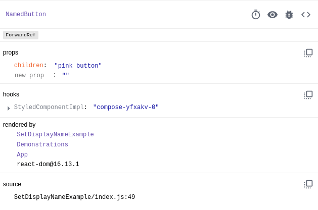
const NamedButton = compose.button(
  setDisplayName("NamedButton")
)`
  background: #dc004e;
  border-radius: 3px;
  border: none;
  color: white;
  cursor: pointer;
  font-size: 16px;
  padding: 5px;
  transition: background 200ms ease-in-out;

  &:hover {
    background: #9a0036;
  }

  &:focus {
    outline: 0;
  }
`

render(<NamedButton />)
NOTE
The display name will not be applied to the class name! Instead, in order to view the display name, you must have React Dev Tools installed, open your browser console and select the "Components" tab. For example:withAttributes
A named export composable function that can either explicitly (via an object) or conditionally (via a function returning an object) append DOM-specific attributes to the node.
const UsernameTextBox = compose.input(
  setDisplayName("UsernameTextBox"),
  withAttributes({
    type: "text",
    placeholder: "Enter username..."
  })
)`
  background: transparent;
  border: 1px solid #555;
  border-radius: 4px;
  font-size: 14px;
  line-height: 38px;
  margin-bottom: 10px;
  padding-left: 10px;
  transition: all 300ms ease-in-out;

  ::placeholder {
    color: #bbb;
  }

  &:hover {
    border-color: #0f7ae5;
  }

  &:focus {
    border-color: #1e87f0;
    box-shadow:
      0px 3px 3px -2px rgba(0,0,0,0.2),
      0px 3px 4px 0px rgba(0,0,0,0.14),
      0px 1px 8px 0px rgba(0,0,0,0.12);
    outline: 0;
  }
`;

const TextBox = extend(
  setDisplayName("TextBox"),
  withAttributes(props => ({
    type:
      props.password
        ? "password"
        : props.type,
    placeholder:
      props.password
        ? "Enter password..."
        : props.placeholder
  }))
)(UsernameTextBox);

render(
  <>
    <UsernameTextBox />
    <TextBox />
    <TextBox password />
  </>
);
withDefaultProps
A named export composable function that explicitly (via an object) appends default props to the node.
const Button = compose.button(
  setDisplayName("Button"),
  withDefaultProps({
    children: "Hi",
    onClick: () => alert("Hi")
  })
)`
  background: transparent;
  border: 2px solid #888;
  border-radius: 0;
  cursor: pointer;
  display: block;
  font-size: 14px;
  line-height: 38px;
  margin-bottom: 10px;
  padding: 0 30px;
  text-align: center;
  text-decoration: none;
  text-transform: uppercase;
  transition: all 200ms ease-in-out;

  &:hover {
    border-color: #555;
  }

  &:focus {
    outline: 0;
    border-color: #888;
  }
`;

render(
  <>
    <Button />
    <Button onClick={() => alert("bye")}>
      bye
    </Button>
  </>
);withProps
A named export composable function that can either explicitly (via an object) or conditionally (via a function returning an object) appends props to the node.
const Button = compose.button(
  setDisplayName("Button"),
  withProps({
    onClick: () => alert("Alert")
  })
)`
  background: transparent;
  border: 4px solid #ff6c47;
  border-radius: 10px;
  cursor: pointer;
  display: block;
  font-size: 14px;
  line-height: 38px;
  margin-bottom: 10px;
  padding: 0 30px;
  text-align: center;
  text-decoration: none;
  text-transform: uppercase;
  transition: all 100ms ease-in-out;

  &:hover {
    border-color: #555;
  }

  &:focus {
    outline: 0;
    border-color: #ff6c47;
  }
`;

const ExtendedButton = extend(
  setDisplayName("ExtendedButton"),
  withProps(props => ({
    ...props,
    onClick: props.alert
      ? props.onClick
      : null
  }))
)(Button);

render(
  <>
    <Button>Alert</Button>
    <ExtendedButton>
      No Alert
    </ExtendedButton>
    <ExtendedButton alert>
      Alert
    </ExtendedButton>
  </>
);withPropTypes
A named export composable function that explicitly (via an object) appends appends prop types to the node.
const Button = compose.button(
  setDisplayName("Button"),
  withPropTypes({
    children: PropTypes.oneOfType(
      [PropTypes.node, PropTypes.string]
    ).isRequired,
    type: PropTypes.string.isRequired,
    onClick: PropTypes.func,
  })
)`
  background: #888;
  border: 2px solid transparent;
  border-radius: 2px;
  color: #eee;
  cursor: pointer;
  margin-bottom: 10px;
  padding: 10px;
  transition: all 200ms ease-in-out;

  &:hover {
    background: #555;
  }

  &:focus {
    border-color: #888;
    color: #eee;
    outline: 0;
  }
`;

render(
  <Button
    type="button"
    onClick={() => alert("Hello")}
  >
    With PropTypes
  </Button>
); NOTE
In order to use the composable "withPropTypes" function, the PropTypes package is required to be installed.withStyles
A named export composable function that can either explicitly (via an object) or conditionally (via a function returning an object or interpolating props using the css helper) append styles to the node.
const Button = compose.button(
  setDisplayName("DefaultButton")
)`
  background: transparent;
  border: 2px solid #888;
  border-radius: 10px;
  color: #888;
  cursor: pointer;
  display: block;
  font-size: 14px;
  line-height: 38px;
  margin-bottom: 10px;
  padding: 0 30px;
  text-align: center;
  text-decoration: none;
  text-transform: uppercase;
  transition: all 100ms ease-in-out;
  width: 100%;

  &:hover {
    border-color: #555;
    color: #555;
  }

  &:focus {
    border-color: #888;
    color: #888;
    outline: 0;
  }
`;

const PrimaryButton = extend(
  setDisplayName("PrimaryButton"),
  withStyles(props => ({
    cursor: "pointer",
    backgroundColor:
      props.primary
        ? "#03a9f3"
        : "transparent",
    borderColor: "#03a9f3",
    color:
      props.primary
        ? "#eee"
        : "#03a9f3",
    "&:hover": {
      backgroundColor:
        props.primary
          ? "#0f7ae5"
          : "transparent",
      borderColor:
        props.primary
          ? "transparent"
          : "#0f7ae5",
      color:
        props.primary
          ? "#fff"
          : "#0f7ae5"
    },
    " &:focus": {
      color:
        props.primary
          ? "#eee"
          : "#03a9f3",
      borderColor: "#03a9f3"
    }
  }))
)(Button);

const SecondaryButton = extend(
  setDisplayName("SecondaryButton"),
  withStyles(CSS`
    background: ${props =>
      props.danger
        ? "palevioletred"
        : "transparent"
    };
    border-color: palevioletred;
    color: ${props => (
      props.danger
        ? "#eee"
        : "palevioletred"
    )};

    &:hover {
      background: ${props => (
        props.danger
          ? "#ca5c80"
          : "transparent"
      )};
      border-color: ${props => (
        props.danger
          ? "transparent"
          : "#ca5c80"
      )};
      color: ${props => (
        props.danger
          ? "#fff"
          : "#ca5c80"
      )};
    }

    &:focus {
      color: ${props => (
        props.danger
          ? "#eee"
          : "palevioletred"
      )};
      border-color: palevioletred;
    }
  `)
)(Button);

render(
  <>
    <Button>Default</Button>
    <DisabledButton>
      Disabled
    </DisabledButton>
    <PrimaryButton>Default</PrimaryButton>
    <PrimaryButton primary>
      Primary
    </PrimaryButton>
    <SecondaryButton>
      Default
    </SecondaryButton>
    <SecondaryButton danger>
      Danger
    </SecondaryButton>
  </>
); NOTE
Due to the syntax highlighter used on this page interpolating its own css styles using the "css" helper function, the example above uses "CSS" as a workaround. This naming convention is only used for demonstration purposes.